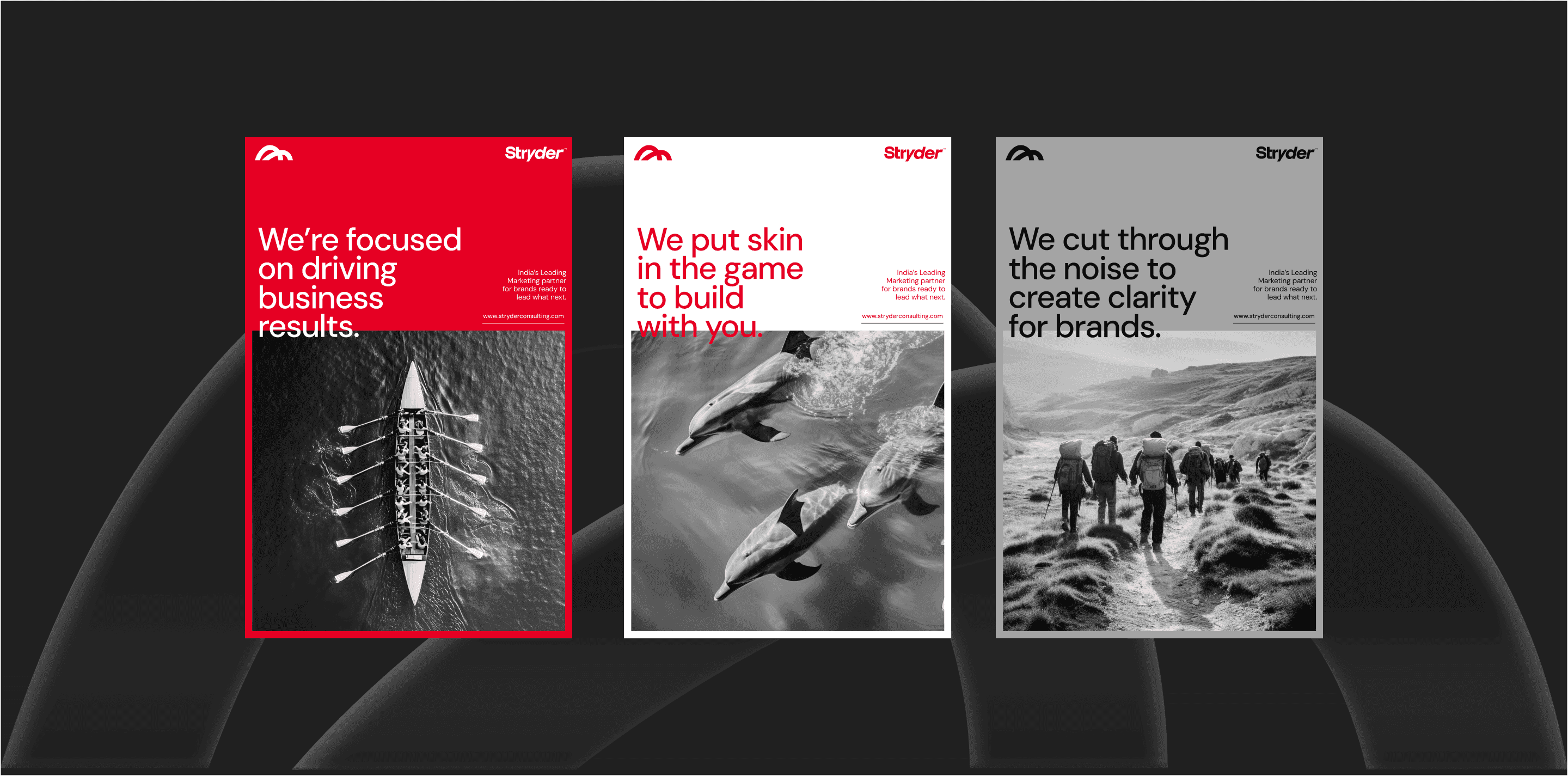
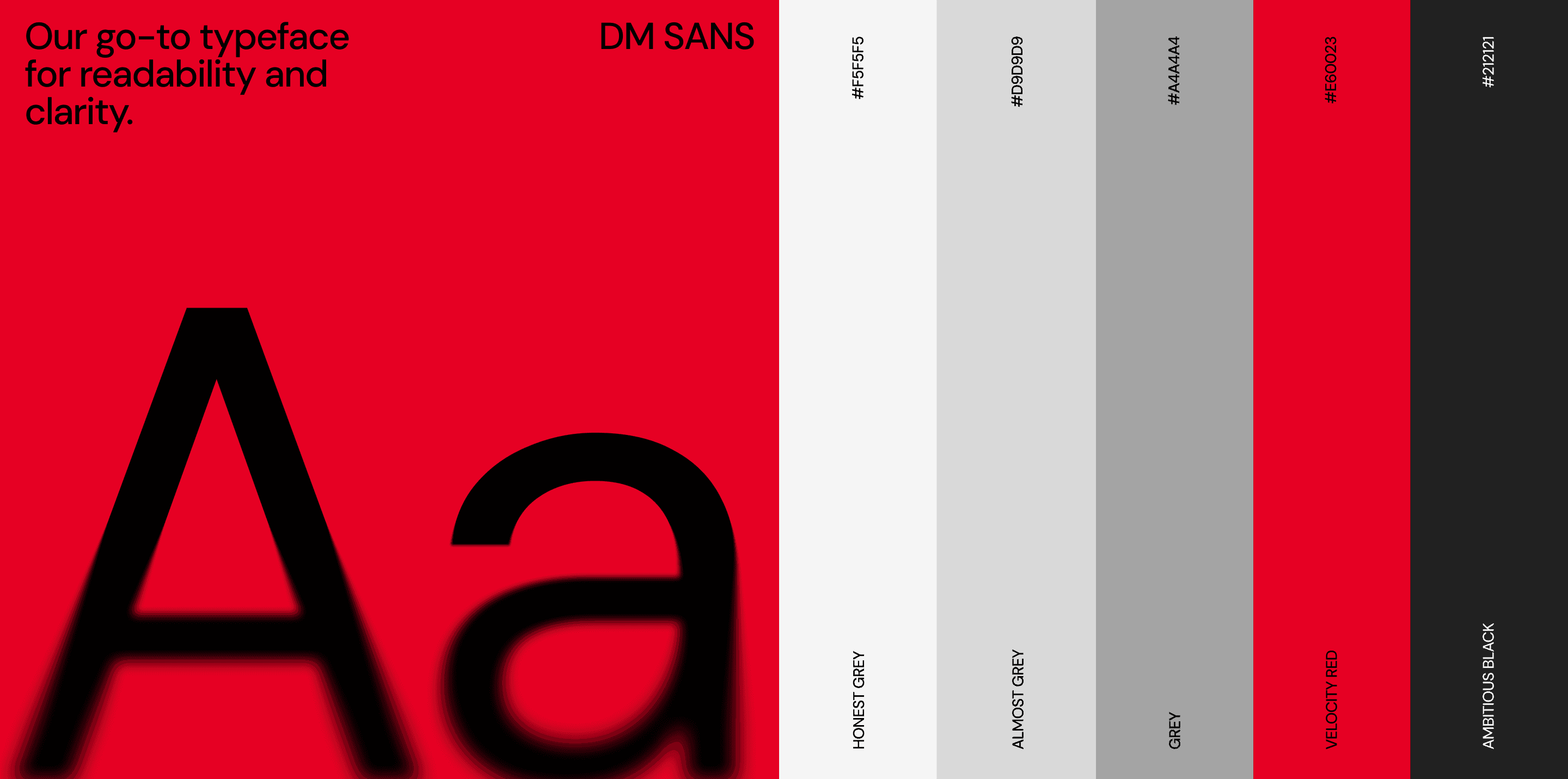
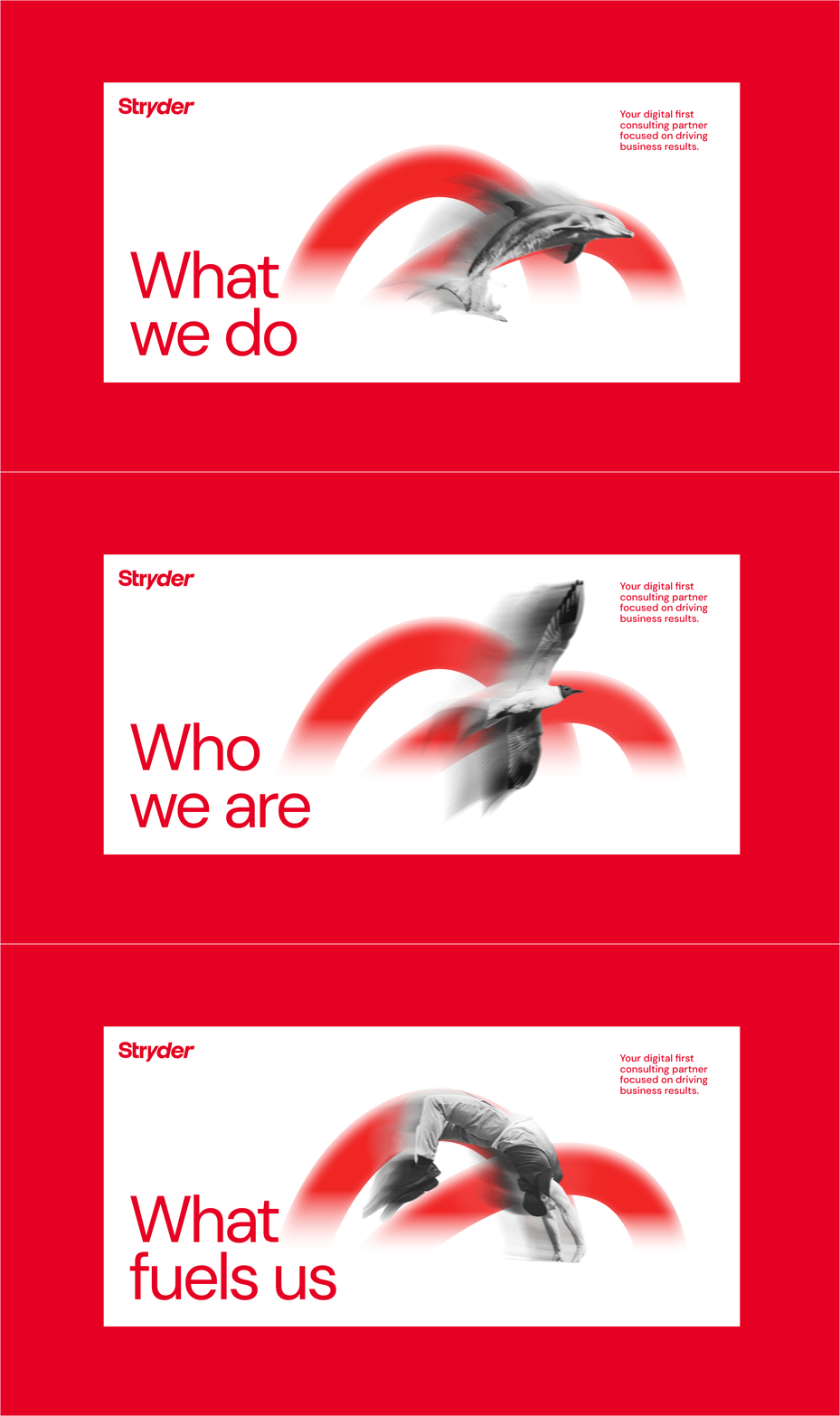
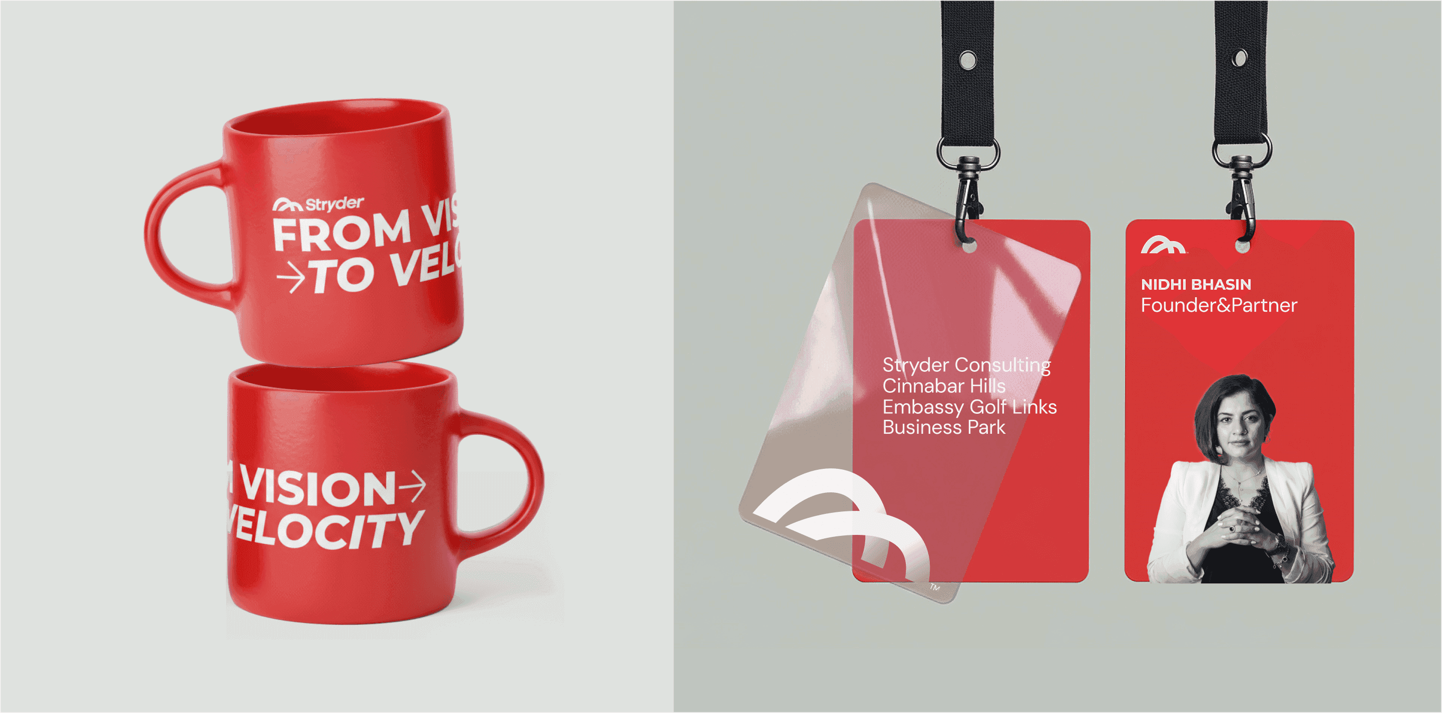
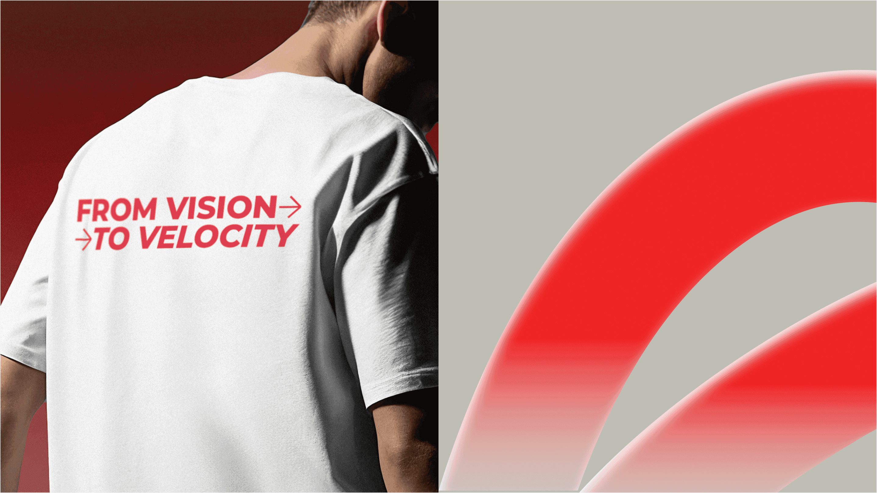
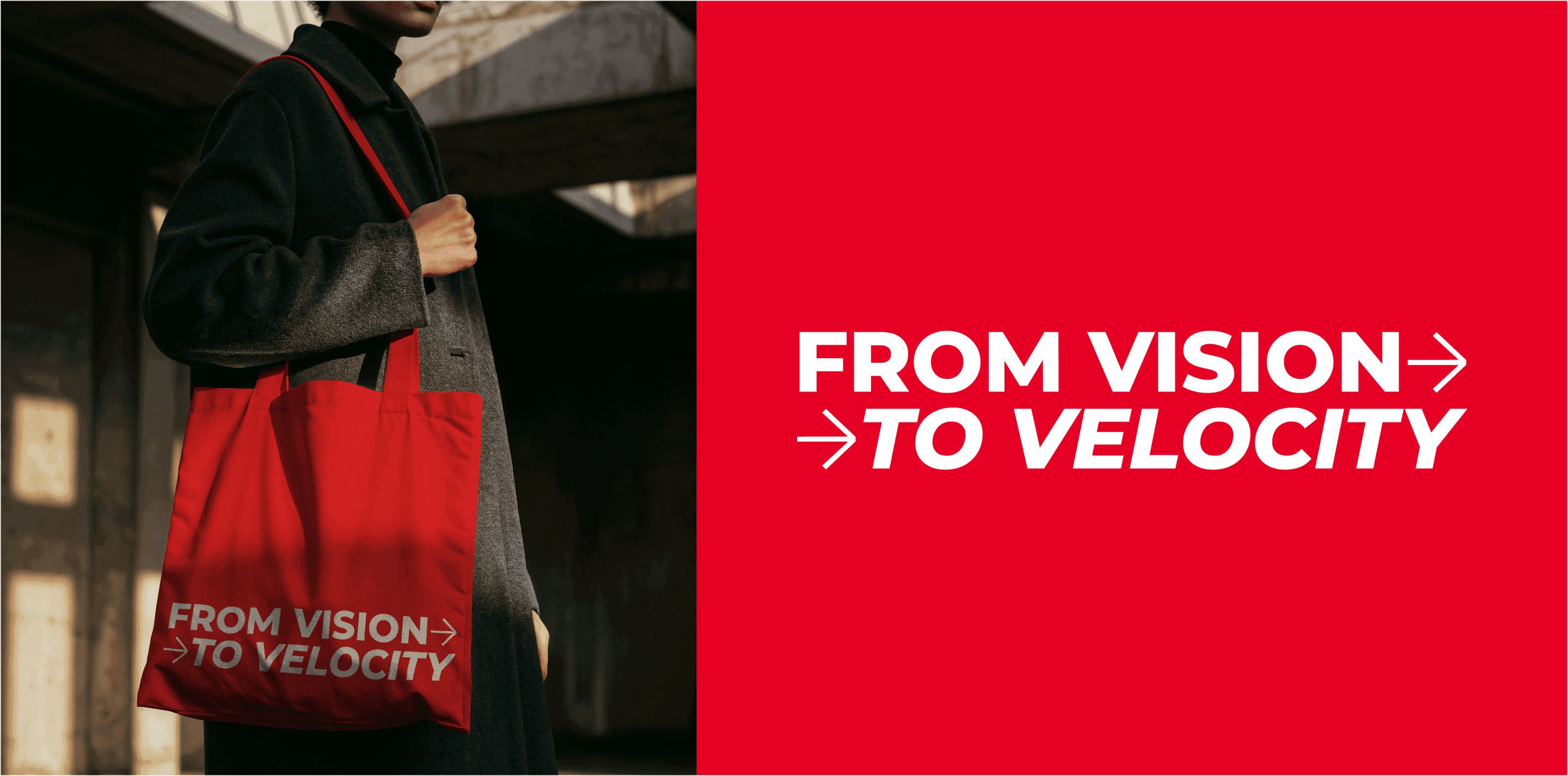
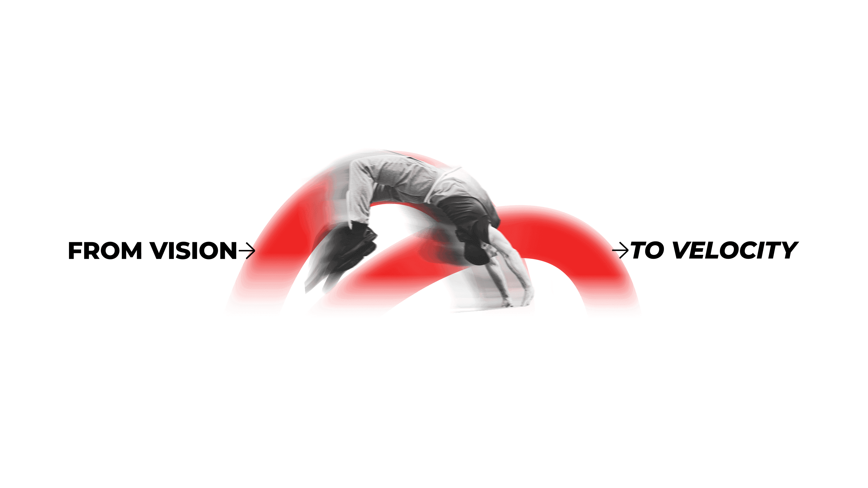
We designed an identity built to stand tall for Stryder Consulting. One that reflects the conviction and clarity a true marketing partner must carry.

Year

2025

Year

2025

Year

2025

Industry

Marketing & Advertising

Industry

Marketing & Advertising

Industry

Marketing & Advertising

Timeline

12 weeks

Timeline

12 weeks

Timeline

12 weeks

Scope of work

New Branding

Tone of Voice

Messaging

Scope of work

New Branding

Tone of Voice

Messaging

Scope of work

New Branding

Tone of Voice

Messaging

About the project

Stryder Consulting is a performance driven marketing consultancy built for brands that like to move fast, scale smart, and grow online with intent. Our work for Stryder spanned strategy, positioning, and brand identity. From mapping competitors, values and defining personality to building a cohesive visual system and brand toolkit.

Stryder Consulting

Logo

Our brand has two distinct yet connected logo forms.

The Primary Logo is our main representation. It captures our sense of motion, drive, and forward momentum through expressive typography. The Logo Mark is Two strides that embody progress in its purest sense. The mark reflects our belief that every stride is different, and that’s what makes growth personal

Brand Promise

“Cutting through the noise to create clarity for brands by transforming data into direction. We put skin in the game to build with you.”

Our brand promise is rooted in our core values transparency, collaboration, responsiveness, and result-driven thinking.

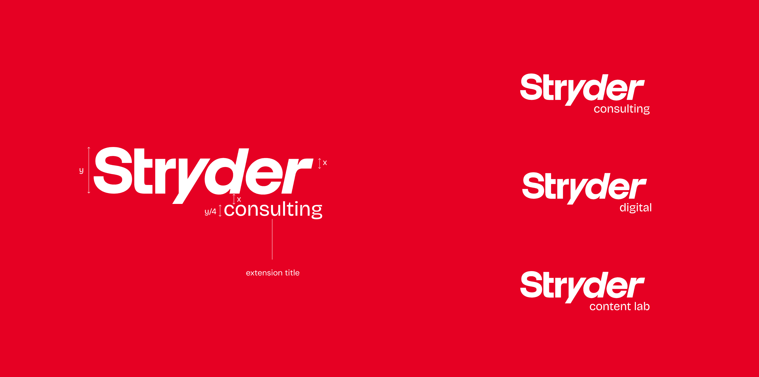
Stryder ConsultingStryder ConsultingStryder Consulting

Strides, The Logo Mark

The Logo Mark is Two strides that embody progress in its purest sense.

The mark reflects our belief that every stride is different, and that’s what makes growth personal.
Stryder ConsultingStryder ConsultingStryder ConsultingStryder ConsultingStryder ConsultingStryder ConsultingStryder ConsultingStryder ConsultingStryder ConsultingStryder Consulting

Final thoughts

Bold doesn’t mean loud. For Strider, it meant clarity, confidence, and a visual language that moves with purpose.

Scattered design?

Let's fold it in one system.

Tell us what you’re building. We’ll design it across brand, UI/UX, website and packaging, on one system that keeps it consistent.

FOUNDER AT FOLDR

Apeksha Gupta

apeksha@foldr.stuido

FOLLOW

STUDIO TIME

9:04 PM

Bengaluru

© 2026 Foldr.Studio®. All rights reserved.

FOUNDER AT FOLDR

Apeksha Gupta

apeksha@foldr.stuido

FOLLOW

STUDIO TIME

9:04 PM

Bengaluru

© 2026 Foldr.Studio®. All rights reserved.

FOUNDER AT FOLDR

Apeksha Gupta

apeksha@foldr.stuido

FOLLOW

STUDIO TIME

9:04 PM

Bengaluru

© 2026 Foldr.Studio®. All rights reserved.